Process
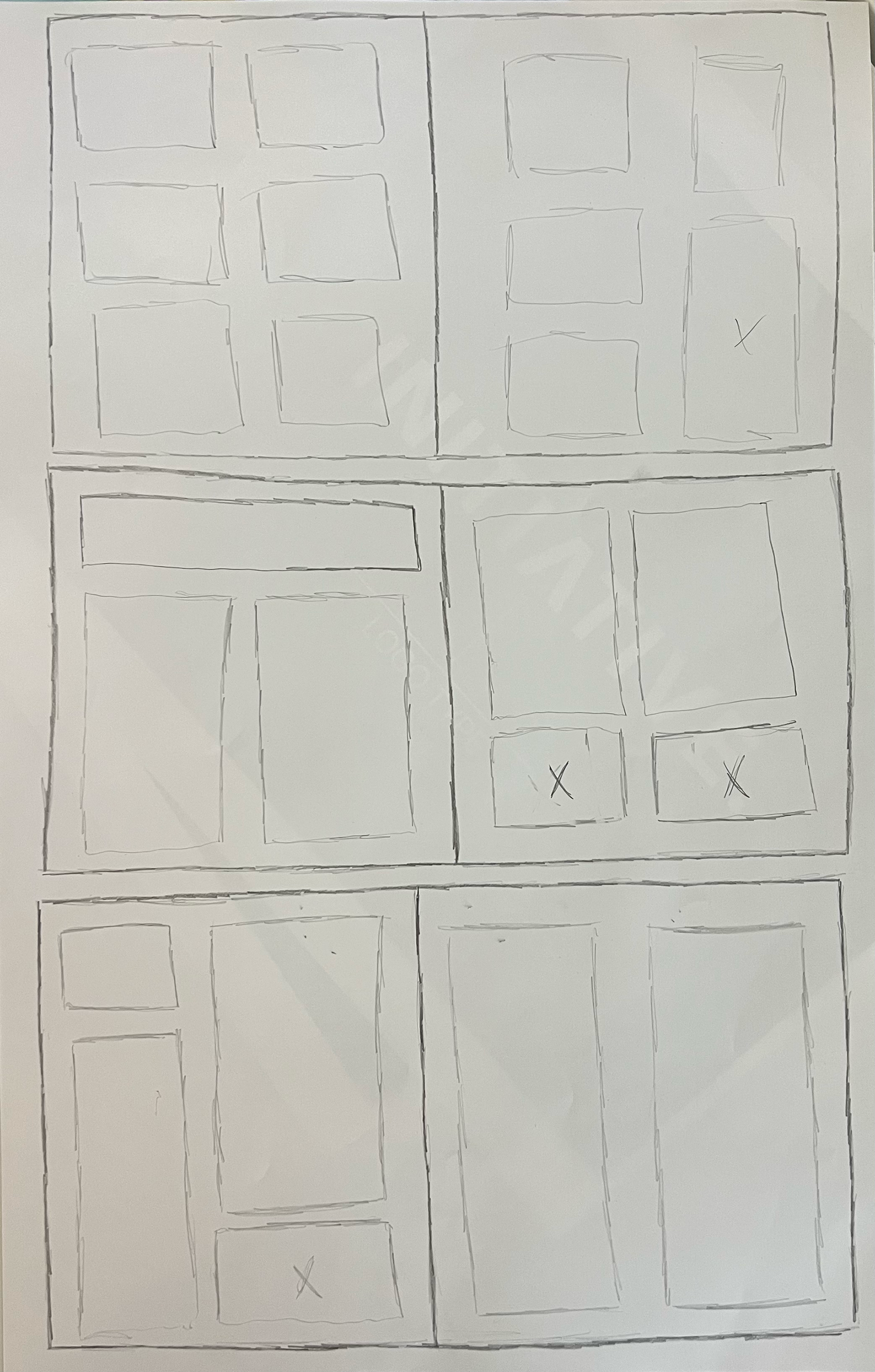
During the sketching process, I referenced existing magazine article formats and took inspiration from their grid layouts to create a unique structure. I gathered imagery and ideas for infographic-style icons, focusing on clear visual hierarchy, readability, and direct relation to the topic while still adding a sense of cleverness. I experimented with different layout structures, spacing, and typography to determine how information could be organized in a way that felt engaging and easy to follow.
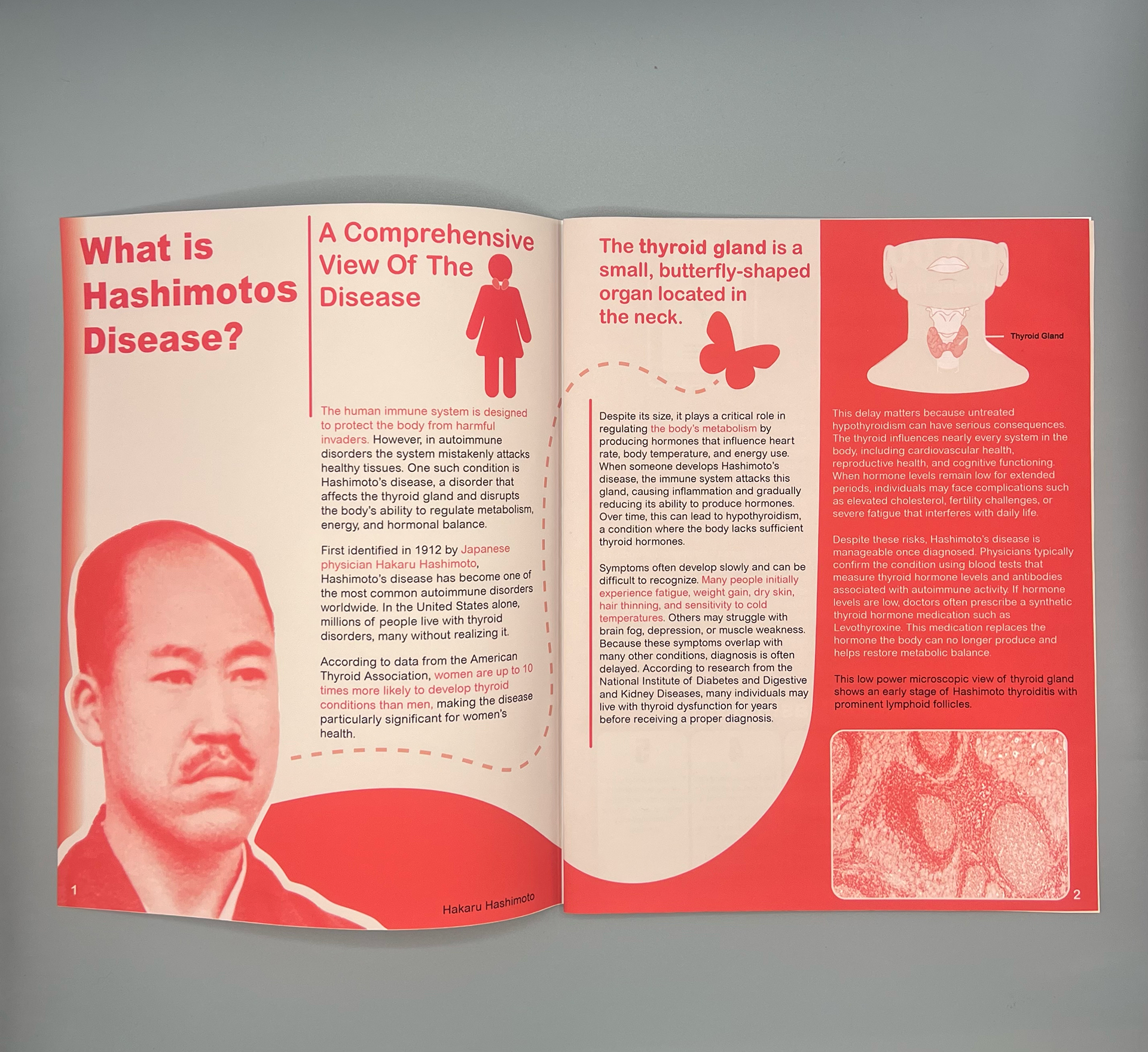
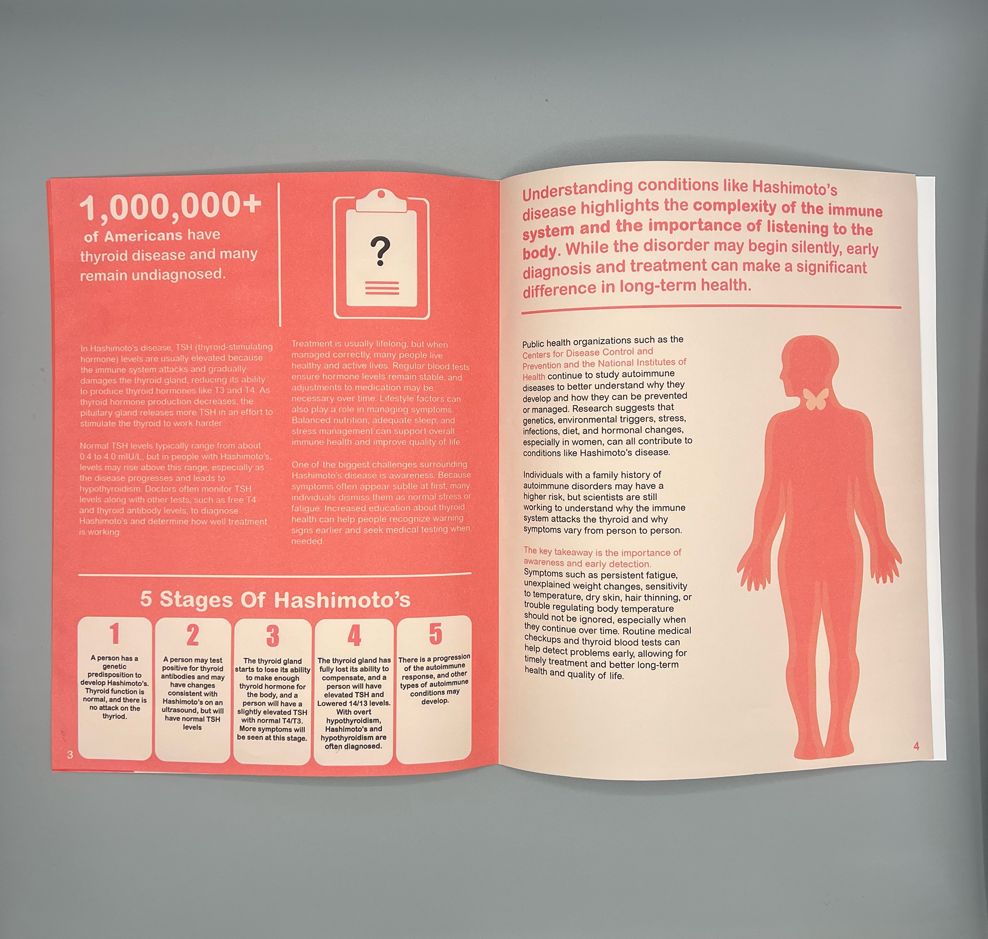
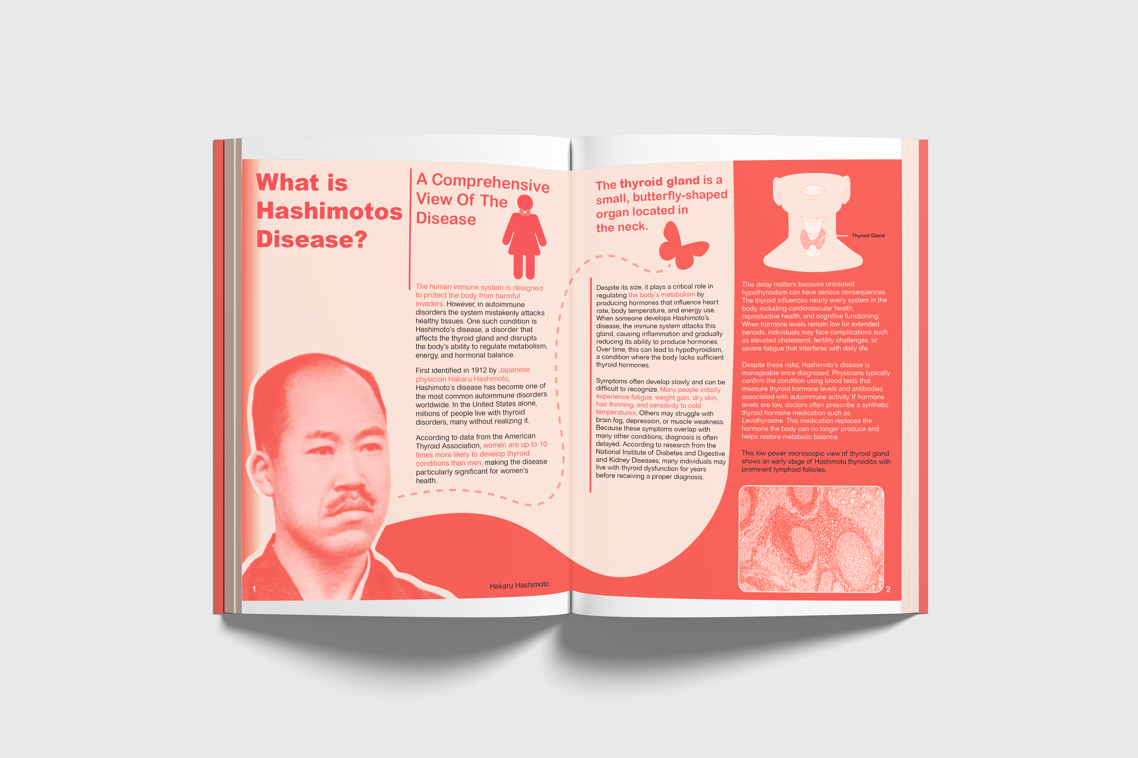
For my article, I used Arial Black Regular for main headlines, Arial Rounded MT Bold for sub-headlines, and Arial Rounded Regular for body text. These type choices helped ensure clarity and organization for the viewer while also adding visual contrast and complexity to the design.
Spread 1 Draft
Why
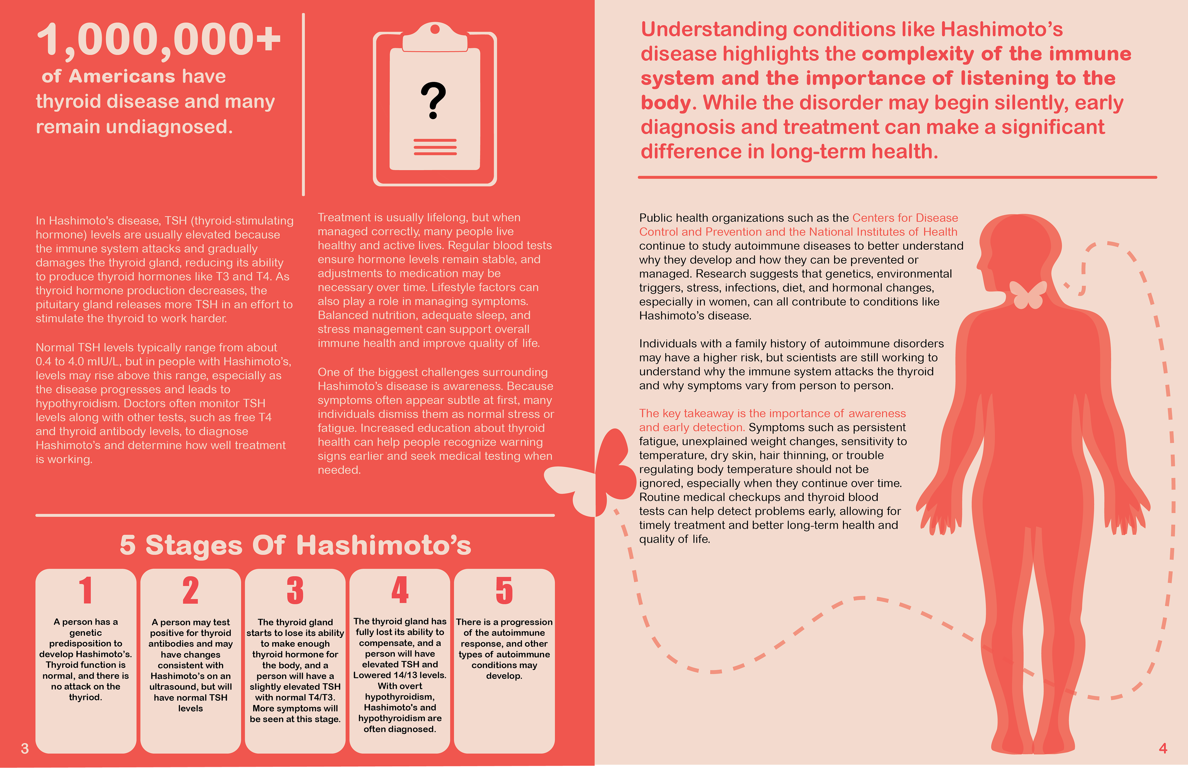
Thyroid disorders affect millions of individuals, yet many people remain undiagnosed due to quiet or misunderstood symptoms. Research indicates that women are significantly more likely to develop thyroid disorders than men, making Hashimoto’s disease an important issue in women’s health. Medical information can often feel overwhelming or inaccessible. By translating research into visual formats, design can support public understanding and encourage earlier recognition of symptoms. Increasing awareness through accessible design can contribute to better health outcomes and more informed decision making.
I used scholarly articles and medical writings to form the narrative presented in the magazine article. As the project progressed, feedback from peers informed adjustments to spacing, alignment, and visual balance. One recommendation I applied from my peers was to extend the text on page 4 to unify the body icon to the spread (This is presented in the Final Outcome at the bottom of the page). I also refined type boxes and arranged images in a tighter fashion to improve consistency and readability.
Spread 2 Draft
Outcome
The final design became successful because the structured layout supports reader flow, while the visual tone communicates trust and clarity. Through the visual tone, I created a “medical-adjacent” article that communicates both urgency and calmness to my audience, particularly women who may be affected by thyroid conditions.
Through this project, I gained insight into the challenges of designing educational materials that communicate complex medical information. I also learned how infographics and magazine layouts work hand in hand to support comprehension. This project proves the importance of balancing aesthetic design with functional communication to effectively reach the reader.
Mockup
Final Outcome